
High performing, cost-effective alternatives to WordPress
website performance
Web


Web
Article 6
Article number 6... this time we're taking a deep dive into images and how they can affect your web page speed.
I'm an ex-marketer (turned dev) sharing information that I wish I'd known when I was marketing.
I see a lot of poor performing websites. Plus a lot of confusion on what to do to speed up sites. Hence this series of article - 10 things that marketers should know about website performance. So far we've covered a lot of ground, check out my other articles tagged 'website performance'.
And remember, web pages that load quickly are super important. They prevent your website visitors bouncing off them. And Google gives you an SEO boost if your pages are fast.
Yes, that's right... one of the most important assets for communicating on a web page and it can destroy page loading speed.
First of all, use PageSpeed Insights to check whether you have an image issue. If you have problems then Insights will throw these warnings:
The solutions for these issues are:
Let's look at each of the solutions in turn. And then some extra tips for you too.
This relates to the 'properly size images' warning from PageSpeed Insights. And relates to the use of photos, rather than icons, or other vector imagery.
This warning relates to different size screens. Your website will be viewed on desktop, tablet, and mobile screens.
To reduce kilobytes downloaded, and consequently speed up loading... developers can instruct the browser to select different sized images for different size screens. Mobile will have smaller images and desktop will have bigger images. If you do this, then this will resolve the warning.
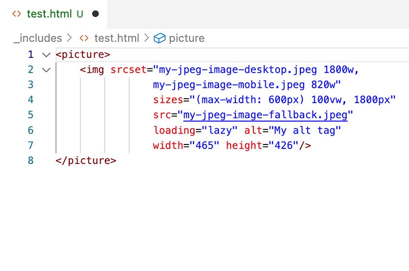
The code is plain HTML using the <picture> tag with the srcset attribute. See example below.
How to check your website to see if it's using this approach... use the following steps:
An example...
My iPhone has a screen width of 414 pixels - in fact it packs in double that amount of pixels (but let's keep things simple... this isn't the time and place for an in-depth discussion on pixel density). Taking the above into account, an image that is full width will need to be double this width so that it looks sharp. I tend to create images for mobile with a width of 820 pixels wide. File size should be about approx 120kb (Jpeg image format). That's roughly the size you should be serving to mobile phones.
My desktop screen is 1920 pixels across... I have a cheap screen it doesn't cram more pixels into it like Apple retina displays. A full width image of 1920 pixels wide should be fine here. It weighs about 560 kilobytes in file size. This is the image to serve for my desktop.
And with the right code in place this is exactly what will happen. Big image of 560kb will appear on my desktop. And the mobile one of 120kb will appear on mobile. Magic, we've just shaved off nearly half a mb of data downloaded on mobile - that will definitely speed things up.
Sadly, I don't see this happening on a lot of websites!
BTW, you can configure the code to deal with all screens types. For example, targeting graphic designers using giant Apple retina screens? Then tweak the code to show bigger images just for their 4000 pixel width screens.
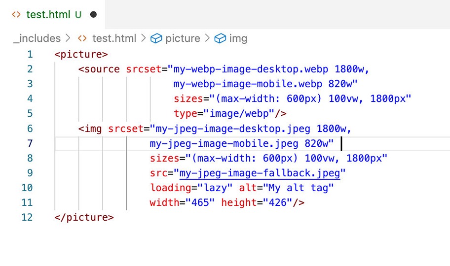
Use modern image types... but have a fallback for screens that don't support them. WebP is a next-gen modern image. Why use it? It's a newer image type that can compress to smaller sizes. So you'll have smaller web pages (in kilobytes), and that means pages that load more quickly.
If you use optimized WebP images then the 'Serve images in next-gen formats' will be resolved.
There are many different image types out there. Here's a quick guide to the most popular image types and what they're good for. Note their names are also their file types. So, my-image.webp is a WebP image.
In a nutshell, use WebP for photos and SVGs for icons. Try Lottie for animations.
If you're using WebP, then make sure you have a fall back jpeg or PNG image for devices that don't support WebP.
The <picture> tag referred to above, also has the ability to decide whether the browser can support WebP images. If it can't, then it can fallback to a Jpeg alternative. With some older browsers not supporting WebP, then a fallback Jpeg is definitely required. See image below:
How to check your website:
By now, if the above approaches have been implemented you should:
WordPress and WebP: WordPress can support WebP these days, so you can start using it with your WordPress website. But make sure you have a fallback Jpeg image. Here's the list of browsers that support WebP... note that iPhones running operating system 13.7 (and older) won't be able to view WebP images in Safari... so you can't just totally forget about Jpeg yet.
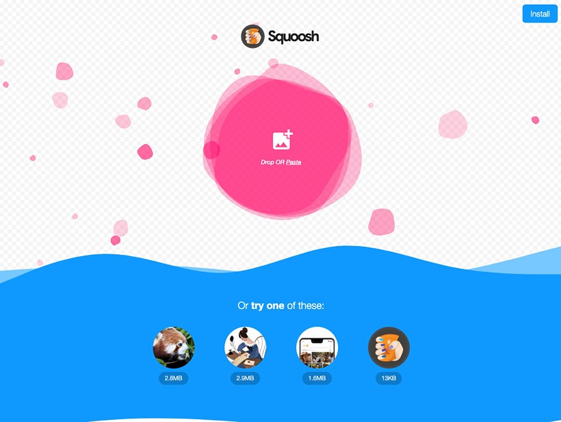
You can use Photoshop to export WebP images as well as these following tools:
Another major point... you can't take a photo from your Canon SLR camera, resize it, and convert it to WebP and then whack it up to your website. Same applies for images downloaded from royalty free image suppliers such as Unsplash.
It needs to be optimized. This is the process of stripping out data from an image for use on a screen.
It's important to note that images that are ready for printed media are different to images that ready for screens. Images for print tend to be larger in dimension and with a high resolution (at least 300 dots per inch). They contain a lot more data. Photos direct from your Canon SLR could be used for a printed brochure without much change.
But images for screens don't need to be so large, need a lower resolution and can be compressed. Software tools can strip out data from the image without the human eye noticing when viewing on a screen. When this has been done we're left with an image that is much smaller in kilobytes.
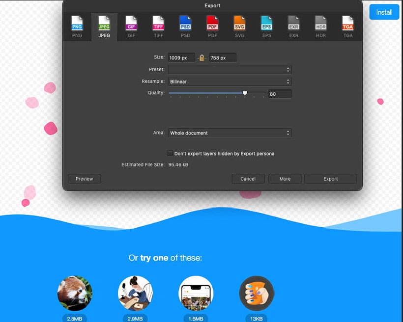
With most image optimisation tools you can choose at what level the optimisation occurs... it's usually expressed as a percentage and referred to as 'quality'. I tend to go straight to 80% quality. For me this seems to be the sweet-spot where my eyes don't notice any quality change but file size plummets.
If you have images further down the screen, i.e. not in view when the page loads then the website visitor may never scroll to them. If never scrolled to then what was the point in downloading them to the browser? Not much point at all!
The above issue will generate the...
... error warning from PageSpeed Insights.
To resolve this issue, we need to lazy load the images that are not on screen. This is the process of loading them as the website visitor scrolls down the web page.
HTML image tags have an attribute called loading. If this is set to "lazy" - then this is exactly what the browser will do. It will dramatically improve the performance of your web page. Especially, if you are using a lot of imagery that needs to be scrolled to.
The code looks like this:
This is an extension of using responsive images. There is an option in CSS to set a background image for a web element. It's used a lot!
In page builders I mainly see this as one option for a page element. This isn't very responsive as we have learnt one size (image) does not fit all screens. Any background image needs to have a mobile option and a desktop option at least.
The good news is that CSS can support testing for screen size. CSS uses so-called 'media queries' to test for different screen sizes. A media query can be configured for providing a mobile friendly background image. And another one for a desktop background image.
Check that your tool of choice can do this. And/or that your web developer has coded it like this.
To do this follow these steps:
A better option for background images is to use a standard image tag (i.e. no CSS with background-image), with text content placed in front of it if required. Using this approach, the <picture> HTML tag can be used. The image appears behind because it has a lower Z-index than the content in front of it. This way is better for accessibility and SEO because an alt tag is exposed. Background images don't have alt tags.
The full-width banner below this blog is made in this way.
With different sizes and different image types, there is now a lot to do for example in making a hero banner. You need a mobile Jpeg, desktop Jpeg, mobile WebP, and desktop WebP... so that's four images instead of one. And that's only targeting two screen sizes.
Marketers could find themselves with a lot to do!
There are some solutions:
This site uses an image plugin. I upload one Jpeg image and it creates all the different sizes I need as well as output all the responsive WebP versions.
But you could also use an image service to return the images which are just right for the browser that is viewing the web page. I.e. mobile images for mobiles, desktop images for desktop. And using the WebP format if this is supported. This service comes at a cost though... imgix is a potential provider.
Spending time sorting your images will give your website an enormous speed boost. So it's worth it!
That's all for now. Until the next article on website performance.
BTW, in the spirit of this series of blog articles, a dolphin can reach speeds of 45km/h. I can only swim about 1km in 30 minutes... make sure your web images are more like this featured dolphin.
If you've found this interesting then don't forget to follow us: LinkedIn, Twitter and Facebook.
Share this article
You might like these other web articles...
Grab a coffee and have a read!
website performance
Web

website performance
Web

website performance
Web

website performance
Web

Helpful guidance, profitable solutions
Get started on a project with Pendigital
Office:
Seaview
Trenoweth Road
Falmouth
TR11 5GH
United Kingdom
 Email Us
 +44 7976 361908
Company Number:
12335082